PTEN Networks Asia/Europe
1994-1998
UPN Channels Asia/Europe
1998-2002

2002-2006
Starting with this logo, the Paramount connections were de-emphasized and the network was exclusively and officially referred to as "UPN". This was the last UPN logo used before the network, as such, folded and was merged with The WB Network to form the present-day CW network.
The Asian/European WB Networks
1998-1999
1999-2006
In 1999, the logo was tilted at an angle; official depictions of it would render it this way for the remainder of the network's run. This logo was first seen in 1995 print advertisement for The WB and was used as a secondary logo until 1999.
The CW Networks Asia/Europe
2006-2008
This was a proposed logo used to advertise The CW Television Network when the announcement of the formation of The CW was first made, and was used on The CW channels until 2008. This logo bears a complimentary resemblance to WGN-TV, a former CW affiliate and was used by that affiliate before network launch.
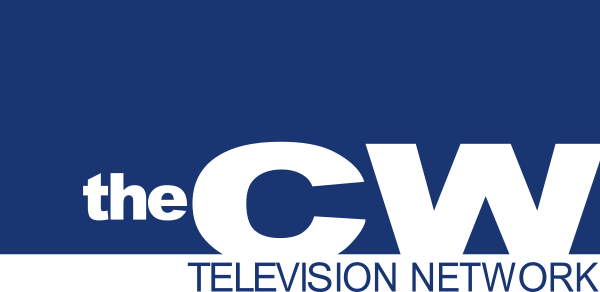
2008-2017
The logo and identity for The CW were created by Troika Design Group. The new logo was presented in May 2006 in the US, and the new logo launched in July 2008. The logo, which consists of the letter "C" and "W" connected to one another, has drawn comparisons to the logo for Time Warner-owned CNN, though the logo also closely resembles the logotype used by Subway Restaurants from 1968 to 2002.
2017-present
On June 12, 2017, The CW Asia and Europe got a new logo. The new logo was created by Brendan Wray which the logo is bold and brash and requires that energy with its visuals. The logo warps to the changing energy of each channel: moody for The CW World; vibrant for The CW Movies; summery for The CW Sports.
Template:The CW Asia Europe